
What Color Contrast Ratio Does WCAG Require (And Why AI Vision Models Struggle With It Too)
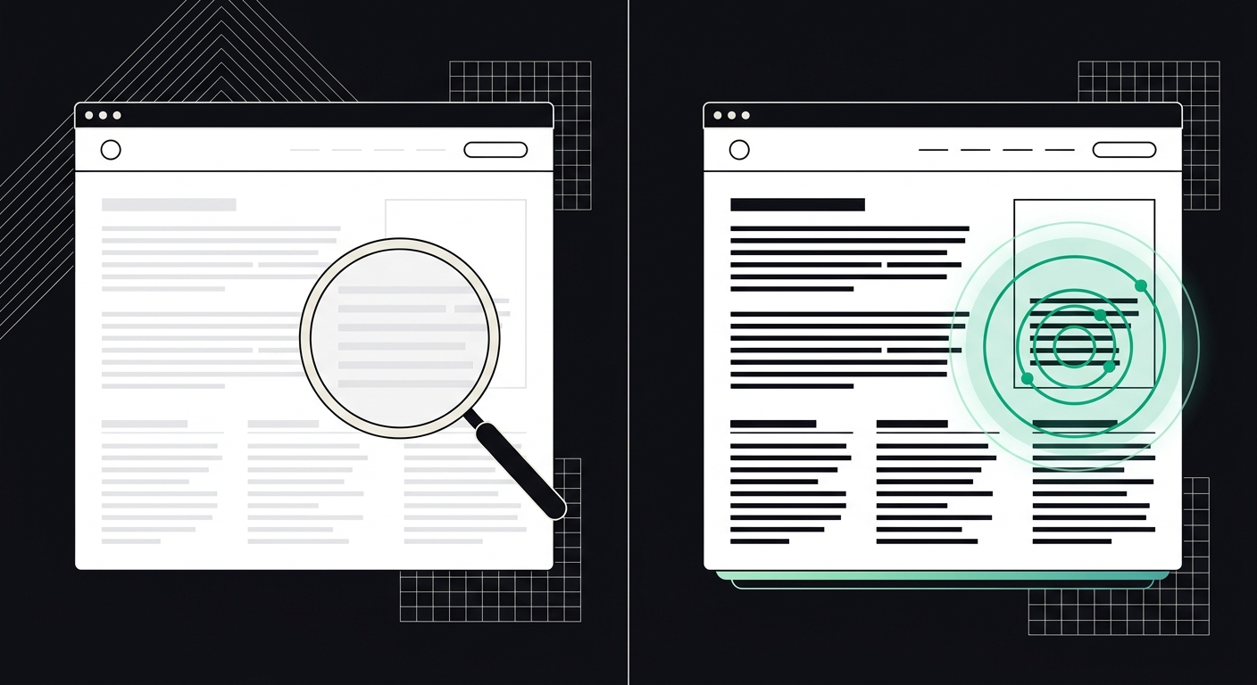
WCAG requires 4.5:1 contrast for text and 3:1 for large text and buttons — and low contrast trips up AI vision models the same way it trips up human eyes.
WCAG 2.1 requires a minimum contrast ratio of 4.5:1 for normal text and 3:1 for large text (18pt+ or 14pt bold) to meet Level AA. Level AAA raises that bar to 7:1 and 4.5:1. If your text doesn't hit those numbers against its background, you fail an accessibility audit — and increasingly, you also make it harder for AI vision models to parse your page correctly.
That second part surprises people. Contrast has always been framed as a human vision issue: low vision, color blindness, aging eyes, glare on a phone screen outdoors. All true. But the tools now crawling and screenshotting the web to answer questions in ChatGPT, Perplexity, and Google AI Overviews run their own visual parsing layers, and washed-out gray-on-white text confuses them the same way it confuses a 60-year-old squinting at a laptop in bright sunlight.
What is the WCAG contrast ratio requirement?
WCAG measures contrast as a ratio between the relative luminance of foreground text and its background color, expressed as a number from 1:1 (no contrast at all, like white on white) to 21:1 (the maximum — pure black on pure white).
The relevant rule is 1.4.3 Contrast (Minimum), and it sets these thresholds:
- Normal text (under 18pt or under 14pt bold): minimum 4.5:1 against its background.
- Large text (18pt+ or 14pt bold and larger): minimum 3:1.
- Incidental text — disabled form fields, decorative text, text inside a logo — is exempt.
There's a separate rule, 1.4.11 Non-text Contrast, that applies the 3:1 minimum to UI components like button borders, form field outlines, and icons. People forget this one constantly. A button with white text on a light-blue background might pass the text contrast check and still fail because the button's own border blends into the page background.
AA vs AAA contrast compliance: what's the difference?
AA is the legal and practical baseline almost every business should target. AAA is stricter and mostly reserved for content where readability is critical — government health portals, legal disclosures, or sites serving a heavily low-vision audience.
Here's the comparison in plain numbers:
| Text type | AA minimum | AAA minimum |
|---|---|---|
| Normal text | 4.5:1 | 7:1 |
| Large text | 3:1 | 4.5:1 |
| UI components / icons | 3:1 | 3:1 (no AAA tier) |
Most legal settlements and demand letters under the ADA cite AA as the standard of reference, since that's what the Department of Justice has pointed to in prior guidance. Chasing AAA across an entire site is admirable but often impractical — it tends to force a mostly black-and-white palette, since a lot of brand colors (soft blues, pastel greens, mid-tone reds) simply can't hit 7:1 without going nearly black. I usually tell clients: hit AA everywhere, then push toward AAA specifically on body copy in long-form content like blog posts or terms pages, where sustained reading matters most.
Why do AI vision models struggle with low-contrast content?
AI models that use vision-based crawling — rendering a page as an image and analyzing it, rather than just reading the raw HTML — inherit a lot of the same limitations human eyes have. A vision transformer trying to OCR light-gray text on a white card is working with the same weak signal a person with low vision struggles against.
This matters more than people realize. Google's AI Overviews, and increasingly other answer engines, use rendered screenshots as part of how they evaluate page layout and extract content when the underlying markup is messy or JavaScript-heavy. If your text visually disappears at low contrast, an OCR-based pass can misread it, skip it, or fail to associate it with the right heading or button.
There's a compounding problem too: a lot of low-contrast text sits on brand-color backgrounds — pale blue buttons, soft-gradient hero sections — and these are exactly the elements AI tools are trying to identify as calls-to-action or key statements. Get the contrast wrong and you're not just failing a WCAG audit; you're making your most important content the least legible to both people and machines. If you want the fuller picture on how crawlers and vision models process a page, our guide to AI readability breaks down the three pillars — crawler access, shared markup, and extractability — that determine whether AI tools can actually use your content at all.
How common is the contrast failure, really?
Very. WebAIM's annual Million report — an automated scan of the top one million home pages — has flagged low-contrast text as the single most common accessibility failure on the web for several years running, typically showing up on somewhere around 80% of home pages tested. That's not a niche bug affecting a handful of sites with bad design instincts. It's the norm.
Why does it happen so often? Mostly design trends, not carelessness. Light-gray body text on white backgrounds has been fashionable for over a decade because it looks clean and modern. Design systems get built around a brand palette chosen for looks, not luminance math, and nobody runs the numbers until an audit flags it. I've seen agency style guides where the "secondary text" gray was picked purely because it looked good next to the logo — nobody checked it against WCAG until a client's legal team asked for a compliance report.
How do I test my website's color contrast?
You don't need to eyeball it or guess. A handful of methods work, depending on how deep you want to go:
- Browser extensions: WAVE and axe DevTools both flag contrast failures directly in the rendered page and show you the actual ratio next to the WCAG threshold it missed.
- Manual color contrast checker tools: WebAIM's own contrast checker lets you plug in hex codes for foreground and background and get an instant pass/fail against AA and AAA.
- Design-stage checks: Figma and most modern design tools now have contrast-checking plugins, so you can catch failures before a single line of CSS gets written — much cheaper than fixing it post-launch.
- Full-site automated scans: for anything beyond a handful of pages, manual checking doesn't scale. A site-wide website color accessibility test crawls every page and flags every text/background pairing that fails, along with the exact hex values involved.
This is one of the 33 checks AccessKnight runs on every scan — it's a quick one to demonstrate the difference between a widget slapping a "high contrast mode" toggle on your site versus an actual code-level fix that changes the underlying color values so every visitor, and every crawler, sees the same corrected content. You can run a free WCAG and AI readability scan on any URL and see exactly which elements are failing, with the specific ratio and the code fix needed.
What are the most common contrast mistakes?
A few patterns show up again and again in audits:
- Placeholder text in form fields. Light gray placeholder text routinely fails 4.5:1, and because it disappears once a user types, teams forget it exists during design review.
- Text over background images. A hero headline in white text looks fine over the dark part of a photo and vanishes over the sky. Contrast has to hold up across the entire image, not just the spot in the mockup.
- Disabled-looking buttons that are actually active. Low-contrast gray buttons often get flagged not because they're exempt (disabled controls are exempt) but because they're fully clickable and just styled to look faded.
- Link text distinguished only by a slightly different shade of the same color. If a link is blue-on-blue with a 2:1 ratio difference from surrounding text, neither color blind users nor most vision models reliably catch it.
- Hover and focus states. Teams fix the default state and forget that hover or focus colors need to clear the same threshold — an easy miss during a rushed redesign.
Contrast failures rarely travel alone, either. Sites with heavy contrast issues also tend to have messy heading structure and thin alt text, because they're usually symptoms of the same root cause: design decisions made without an accessibility pass. If you're auditing contrast, it's worth checking heading structure and alt text quality at the same time.
Key Takeaways
- WCAG AA requires 4.5:1 contrast for normal text and 3:1 for large text and UI components; AAA raises that to 7:1 and 4.5:1.
- Low contrast is the most frequently cited WCAG failure on the web, showing up on roughly 80% of home pages in WebAIM's annual Million report.
- AI vision models that render and OCR pages inherit the same limitations as human eyes — low-contrast text can get skipped, misread, or mis-associated with the wrong element.
- Design-stage contrast checks are cheaper than post-launch fixes; use a contrast checker before CSS gets written, not after a complaint comes in.
- Contrast failures usually cluster with other issues — messy headings, thin alt text — so a full-site scan catches more than a spot check.
Frequently Asked Questions
What is the minimum WCAG contrast ratio for normal text?
The minimum is 4.5:1 for Level AA compliance. This applies to any text smaller than 18pt (or smaller than 14pt bold). Large text gets a slightly lower minimum of 3:1.
Do I need AAA contrast compliance or is AA enough?
AA is enough for the vast majority of businesses and is the standard most legal and regulatory guidance points to. AAA (7:1 for normal text) is worth pursuing on content where sustained reading matters most, like long-form articles or health and legal information, but forcing AAA across an entire brand palette usually isn't practical.
Can I check color contrast without a browser extension?
Yes. You can plug hex codes into a manual color contrast checker like WebAIM's tool, or use built-in plugins in design software such as Figma. For checking an entire live site rather than individual color pairs, an automated scanner is faster and more thorough.
Why would low contrast affect how AI reads my website?
Some AI crawlers and search tools render pages visually and use OCR-style parsing as part of understanding layout, especially on pages with heavy JavaScript or messy markup. Low-contrast text is harder for that visual parsing to detect accurately, the same way it's harder for a person with low vision to read.
Does color contrast affect ADA lawsuit risk?
Yes. Contrast failures are one of the most commonly cited issues in ADA web accessibility demand letters and lawsuits, since they're easy to detect with automated scans and clearly tied to a named WCAG success criterion (1.4.3). It's one of the first things a plaintiff's expert will check.
What contrast ratio do buttons and icons need?
Interactive UI components like button borders, form field outlines, and icons need a minimum 3:1 ratio against their background under WCAG rule 1.4.11, separate from the text contrast rule. This one gets missed often because teams check the text on a button but not the button's own border or fill color.
Conclusion
Contrast is one of the few WCAG rules where the fix is almost always a one-line CSS change — swap a hex code, done. The hard part isn't fixing it. It's finding every instance across a site that's accumulated years of design tweaks, rebrand-driven color updates, and half-finished style guides.
If you haven't run a full contrast pass recently, start there before anything else on your accessibility list. Grab your current brand palette, check every text/background pairing against 4.5:1, and don't forget button borders and hover states. Or just run your homepage through a scanner and get the specific failing elements, ratios, and code fixes in one pass — that's exactly what AccessKnight's free scan is built to hand you.
Check your website's accessibility
Scan against all 33 WCAG 2.1 rules and get code-level fix suggestions — free.
Run a free scan →